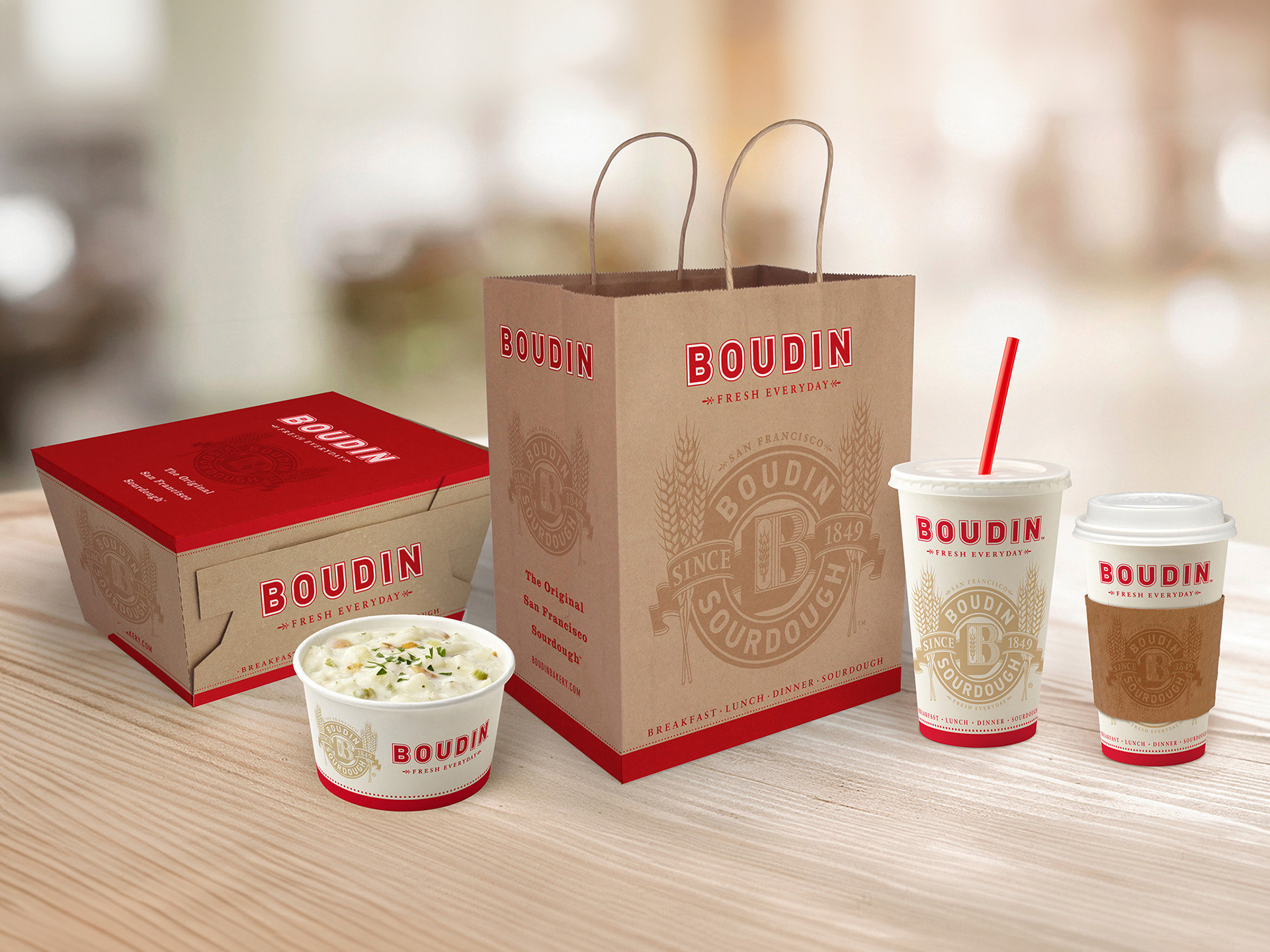
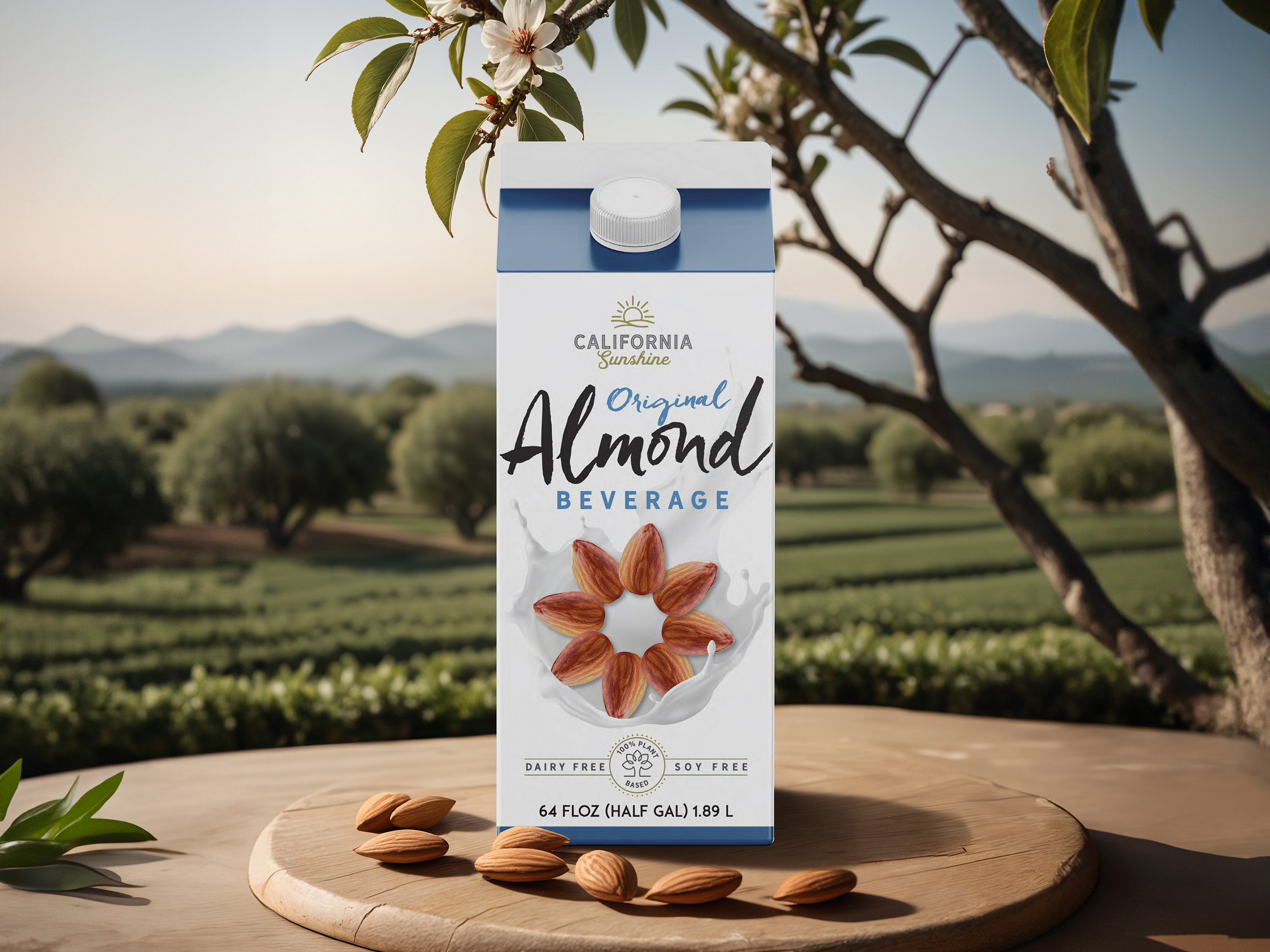
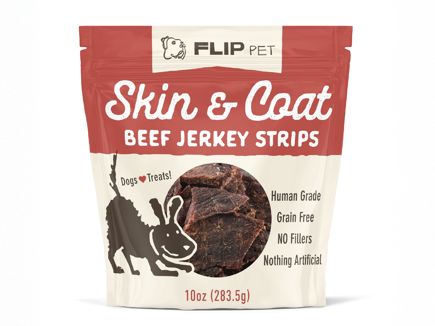
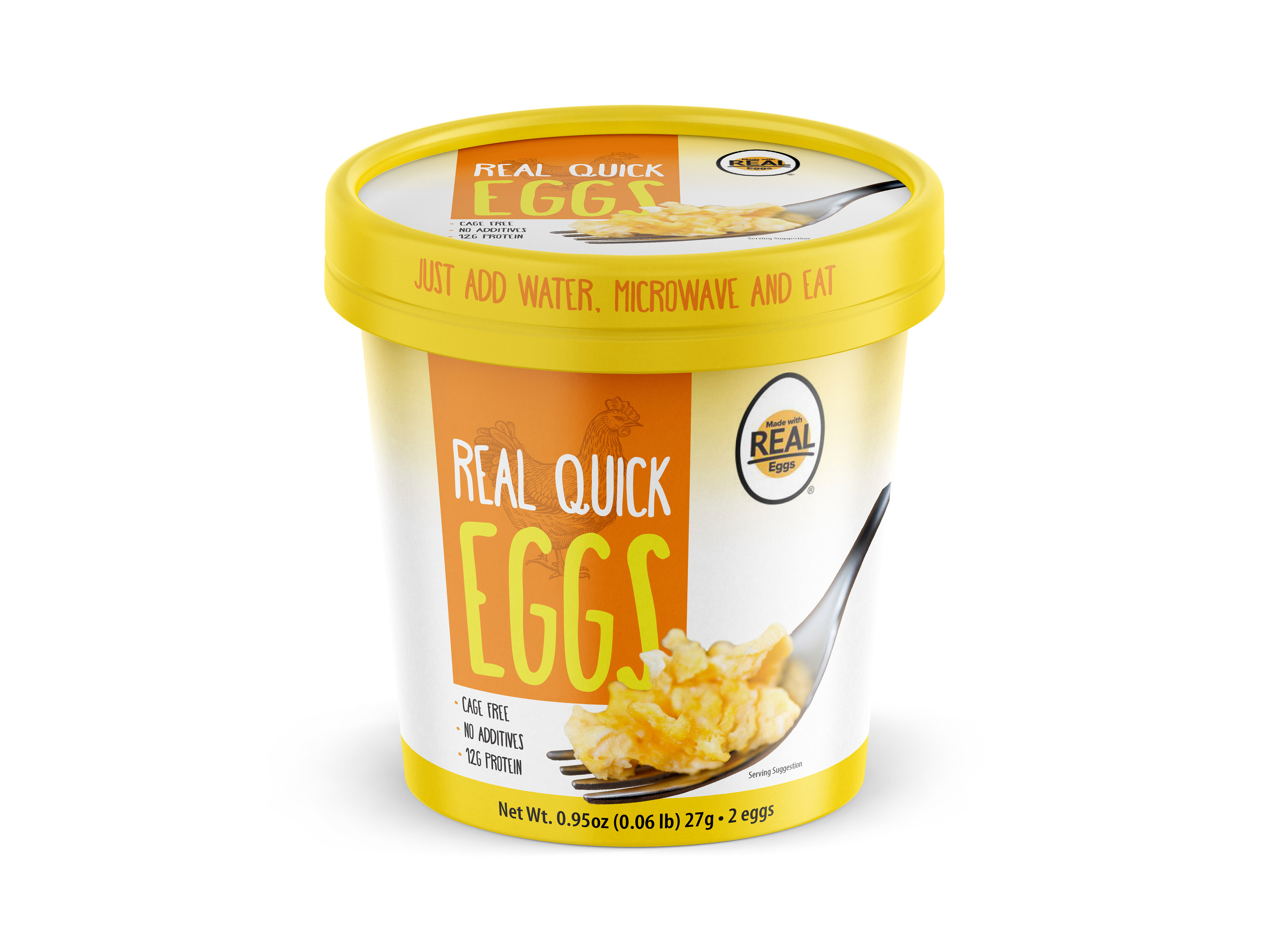
Below are initial concepts presented showing a stretch of ideas all communicating high-quality and authenticity.
Designing a cohesive line of Italian products – fettuccine, olive oil, and pasta sauce. Crafting a visual identity that conveys both the rich heritage and premium quality of the products. Here's a detailed breakdown of the design process for this line:
1. Concept Development
Inspiration: The visual identity is rooted in Italian tradition, drawing from the elegance and character of historic architecture. A screened-back image of a historic building serves as a subtle yet impactful backdrop, anchoring the design in heritage.
Target Audience: The focus is on consumers seeking high-quality, authentic Italian products with a luxurious touch.
2. Color Palette
Gold Accents: Gold details are incorporated to signify premium quality and luxury. These accents add warmth and catch the eye, aligning with consumer perceptions of upscale products.
Distinct Swing Colors: Each product is assigned a unique color to differentiate it within the line (e.g., earthy green for olive oil, deep red for pasta sauce, and a dusty royal blue for fettuccine). This not only aids in product identification but also adds vibrancy to the collection.
3. Design Elements
Historic Backdrop: The lightly screened-back image of the historic building lends a timeless quality. This element is subtle enough to avoid overpowering other design components but rich in detail to enhance the product's story.
Scalloped Edge: A delicate scalloped border frames the label or packaging, evoking the feeling of receiving a beautifully wrapped gift. This touch reinforces the sense of luxury and care associated with the brand.
4. Typography and Layout
Typography: Classic serif fonts are used to complement the historic theme.
Layout: A balanced composition ensures the key elements—product name, type, and visual accents—are prominently featured while maintaining an airy, upscale feel.
5. Execution
Packaging Materials: High-quality materials are chosen for the packaging (e.g., textured paper, matte finishes) to enhance the tactile experience.
Consistency: Each product is designed to stand out individually while maintaining a cohesive look as part of the line.
Outcome
The final design feels elegant, gift-like, and steeped in tradition, making it appealing to discerning customers who value authenticity and quality in their Italian culinary experiences.

