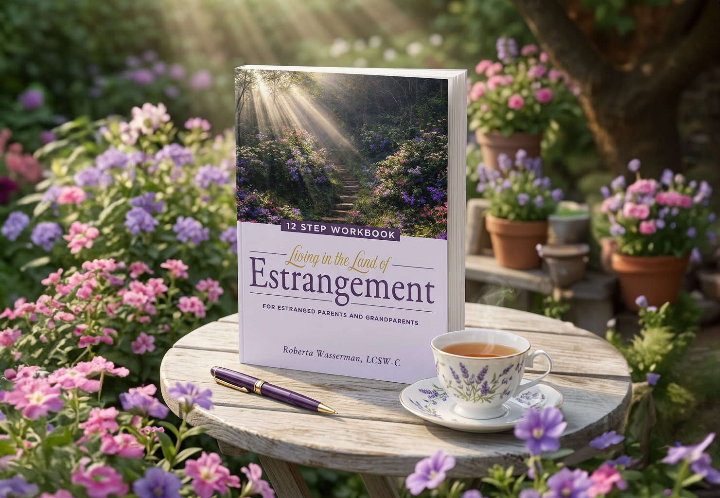
Design: Living in the Land of Estrangement
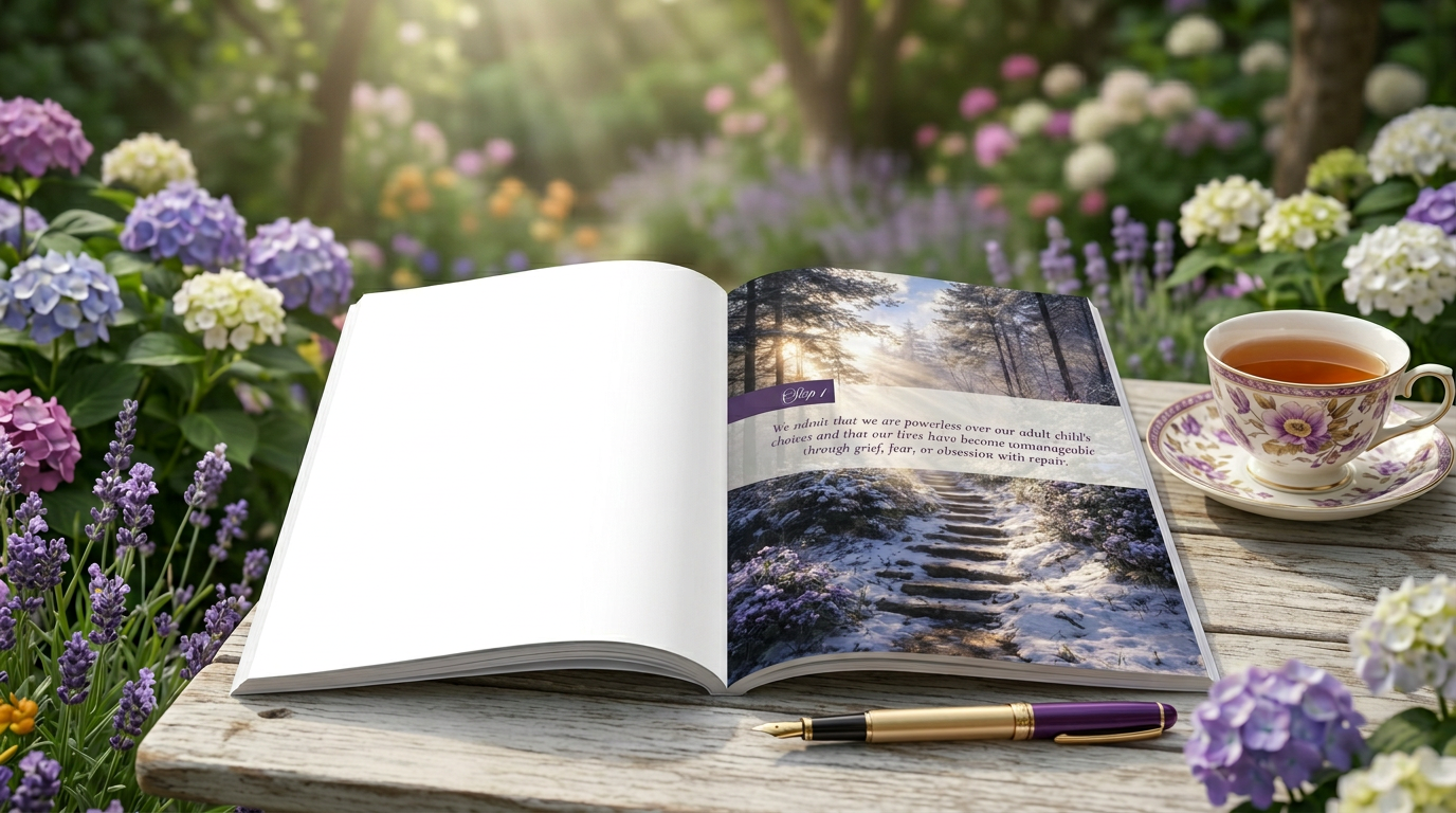
The visual direction for Living in the Land of Estrangement reflects both the weight of estrangement and the hope of healing. The cover features a garden pathway leading into light, symbolizing a deeply personal journey—one step at a time—toward clarity, peace, and possible restoration. Surrounded by a lush, living garden and soft natural light, the imagery creates a calm, reflective space that invites the reader in with a sense of quiet reassurance.
This journey continues throughout the interior, where each of the 12 steps is paired with a unique photographic moment drawn from the cycle of seasons—moving from early spring through late winter. This seasonal progression reinforces the idea that healing is not linear, but evolving and cyclical. The color palette shifts alongside each chapter, transitioning naturally through the seasons to create a visual rhythm that mirrors the emotional experience of the reader.
Typography and tone were carefully balanced to support this message. A grounded serif typeface anchors the word “Estrangement,” while a more fluid script for “Living in the Land of” adds a human, emotional touch. Together with the soft lavender and natural green palette, the design positions the workbook not just as a resource, but as an experience—one of reflection, growth, and gentle forward movement.