Christians Under Fire — Complete Book Design & Production
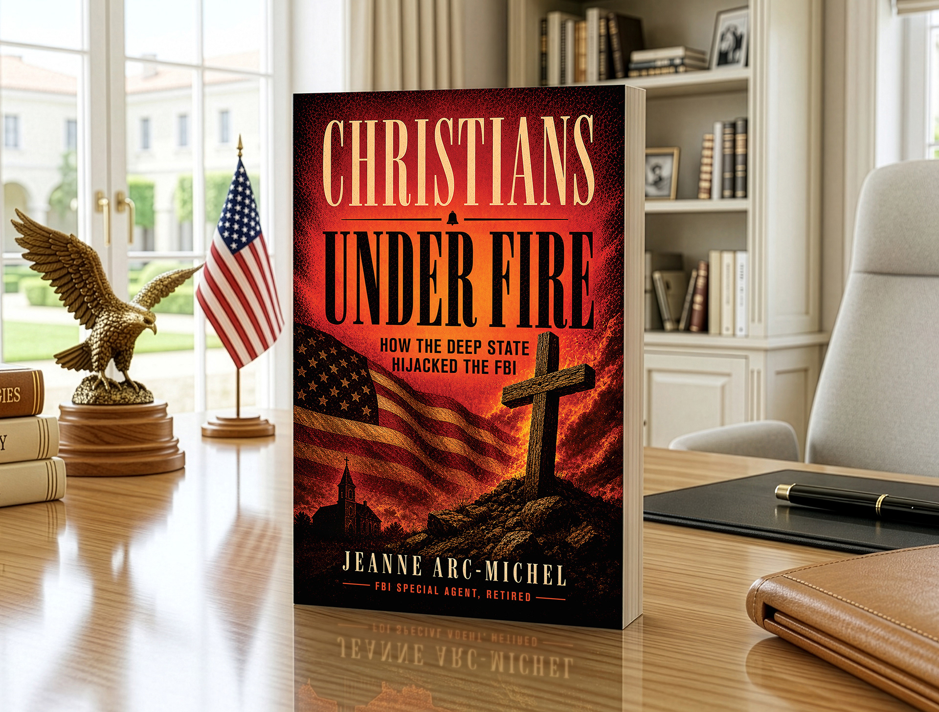
For Christians Under Fire, I developed a bold visual direction that reflects the urgency of the book’s message. The red and orange color palette was chosen to feel like an alarm — a symbolic warning that Christians are “under fire.” The cover combines fire, flag, cross, and distressed textures to create a dramatic, high-impact design that immediately communicates conflict, faith, and national consequence.
This was more than a cover design project. At 530 pages with 778 footnotes, the book required a disciplined interior layout system, careful typography, consistent chapter formatting, and detailed footnote management. The goal was to make a complicated, highly documented manuscript feel readable, credible, and professionally published from cover to cover.


"I've seen more book covers than I can remember, but something about this one just hits differently. I can feel the moment I look at it that someone put real heart and intention behind it. It's polished, it's magnetic, and it carries a weight that most books never quite reach. This is the kind of work that makes people slow down, take it in, and feel something genuine. I truly hope this book gets every bit of recognition it deserves. Gorgeous work. Truly excellent."
Comment from X viewer